Conception
This concept has been done ad absurdum (Super Mario, Pokémon, Skyrim, Legend of Zelda, Breaking Bad, Adventure Time, World of Warcraft, Lord of the Rings, and the exceptional HootSuite ad), which is a testament to its strength. Like Game of Thrones, the BoP uses Fantasy Counterpart Cultures well, so the hardest part was deciding who to leave out, rather than in.
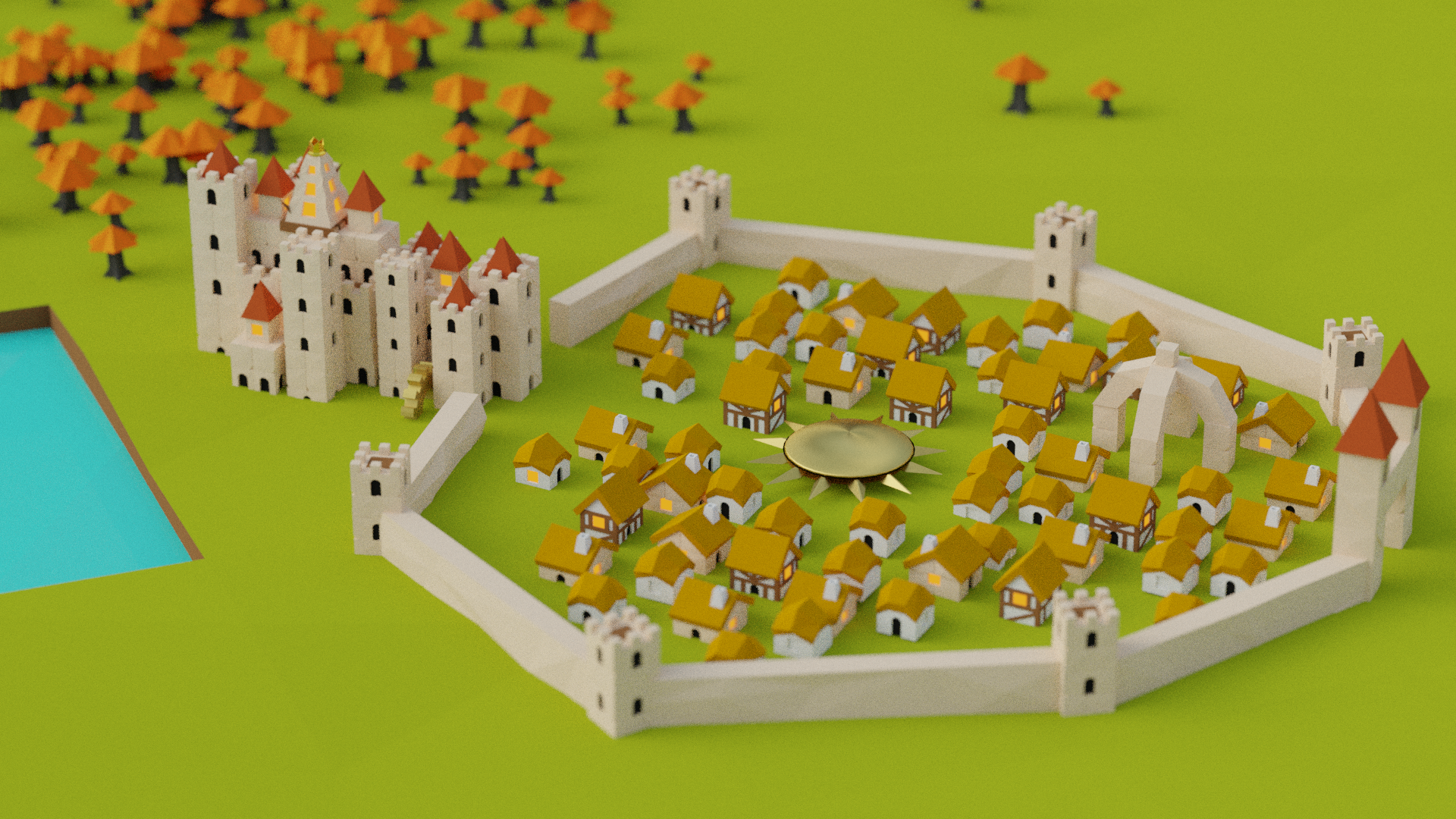
King’s Landing – Hoodrick
The Hoodrick are the British looking tribe and are the only ones with castle-like blocks in the game, so this decision was straightforward.
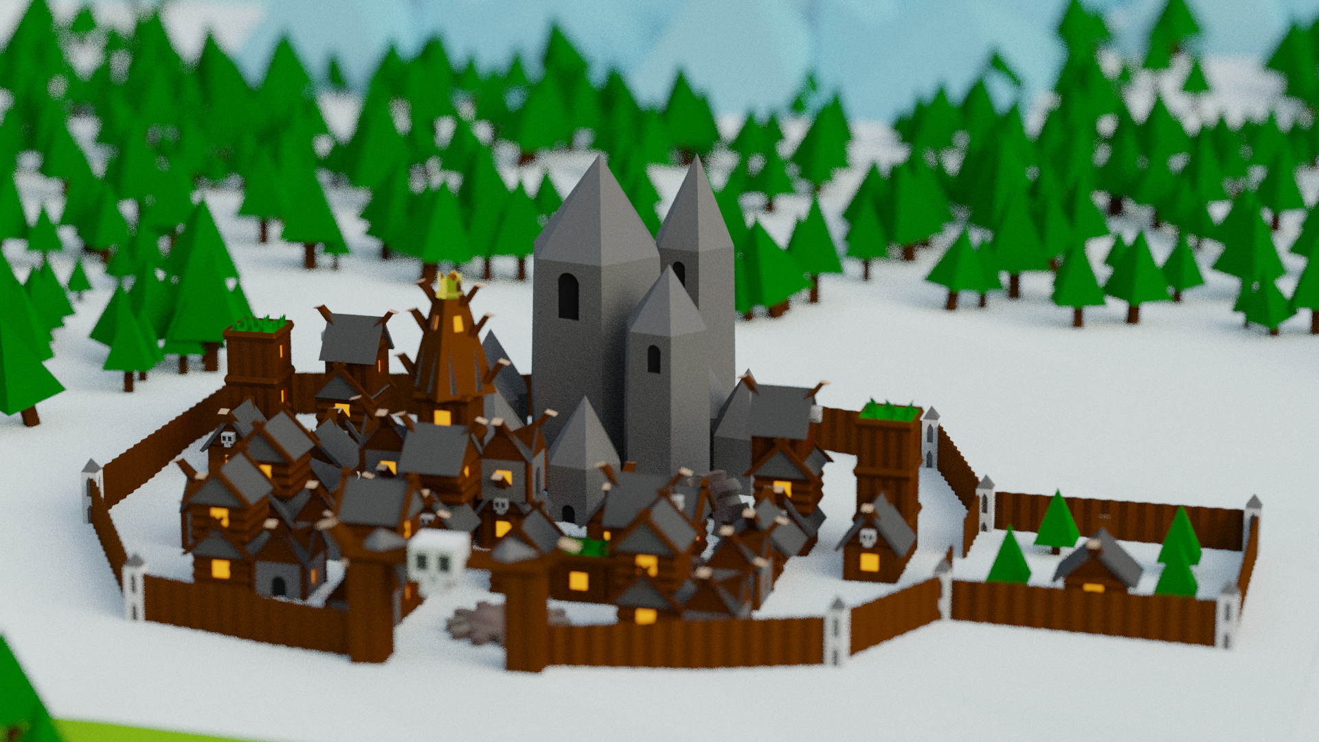
Winterfell – Bardur
Another straightforward decision. Though the Starks are not portrayed as violent as the Viking-like Bardur, they are (almost) the only winter-themed tribe in the game.
The Wall – Polaris
The wall was a challenging one to portray. It actually was tacked on towards the end of the animation workflow, where I needed to pay homage to it somehow and infill the space between Bardur and Luxidoor. I also wanted to include Polaris in the video, which are obviously inspired by the White Walkers.
Hardhome was the original idea, but I did not have the sprites to model their buildings (or patience left to do any more modelling). Ultimately, I decided to show the wall breached, like the Night King did in GoT, and with a Polaris moving fortress. North of the wall is where the switch occurs from Bardur model mountains and trees to Polaris ones.
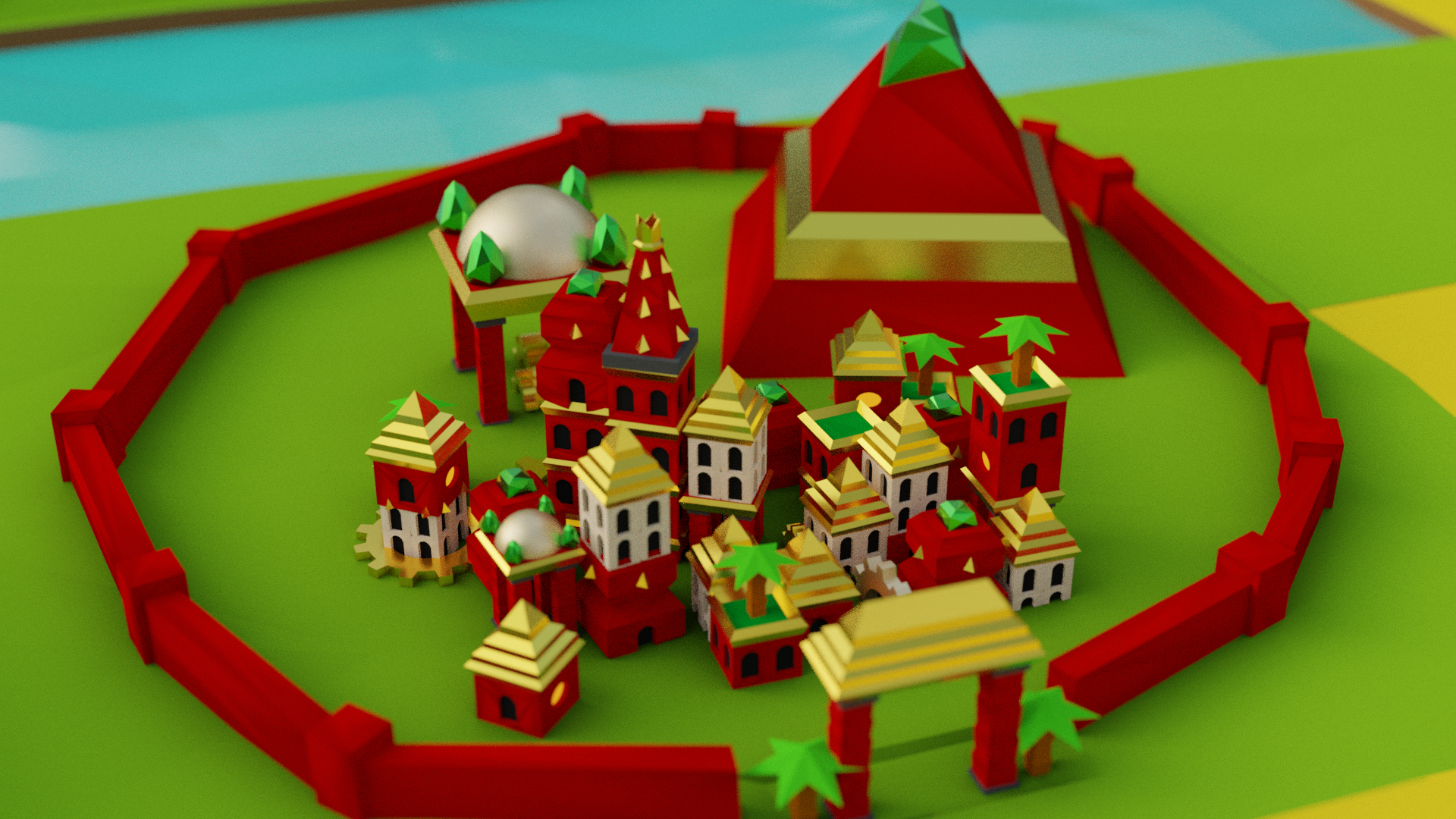
Qarth – Luxidoor
Essos is where the fun happens as there are so many eastern-themed tribes in the game that can fit the theme of the various GoT cultures. Luxidoor as Qarth was obvious to me, as they are both known for wealth and opulence, and I wanted to model Luxidoor’s beautiful buildings.
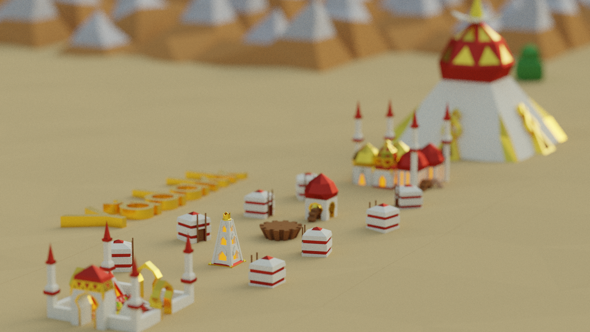
Vaes Dothrak – Yaddak
Yaddak are the Turkic themed tribe in BoP and whilst are portrayed as more Persianised, rather than the nomadic, Mongol-like Dothraki, they are the only tribe with Yurt-like buildings in the game. I also wanted to include the camera tilt in use from the Game of Thrones intro which are used for Vaes Dothrak and Pentos.
In addition to the cultures portrayed, the world of this video will be at the junction of a concave cube, a fusion of the concave earth of the GoT intro and the flat “Square” of BoP, separating the two landmasses.
Ideas on the Cutting Room Floor
Vengir
I love their look, and would have fit thematically and aesthetically as Harrenhal, Dreadfort, or Asshai (though the latter never appeared in the show).
Imperius
As any of the free cities (e.g. Braavos, Pentos, Volantis). However, the art style isn’t too interesting.
Aquarion
As Braavos, which is the GoT equivalent of Venice. In addition, Braavos’ colossus would fit with Aquarion’s Eye of God.
Oumaji
As any of the slaver cities which are Middle Eastern in appearance.
Ai-Mo
As the Vale, though it is not a European looking tribe.
Modelling
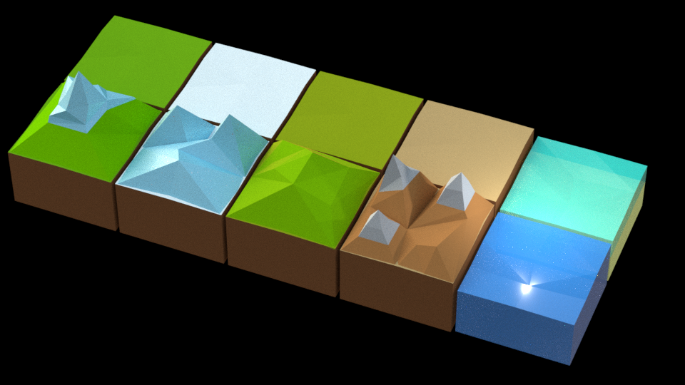
Modelling was straightforward for most items. It was only three terrain tiles which would then be recolored, and 15 models for the four main tribes (including the mountain and trees). Polaris was done separately where only the moving fortress, tree, and mountain was done. My original plan was to model ALL the game’s tribes, but I quickly realized how ridiculously time consuming that would be. I also realised that these models were drawn directly, rather than modelled, as there was a lot of impossible geometry at play. Midjiwan did not make this easy!
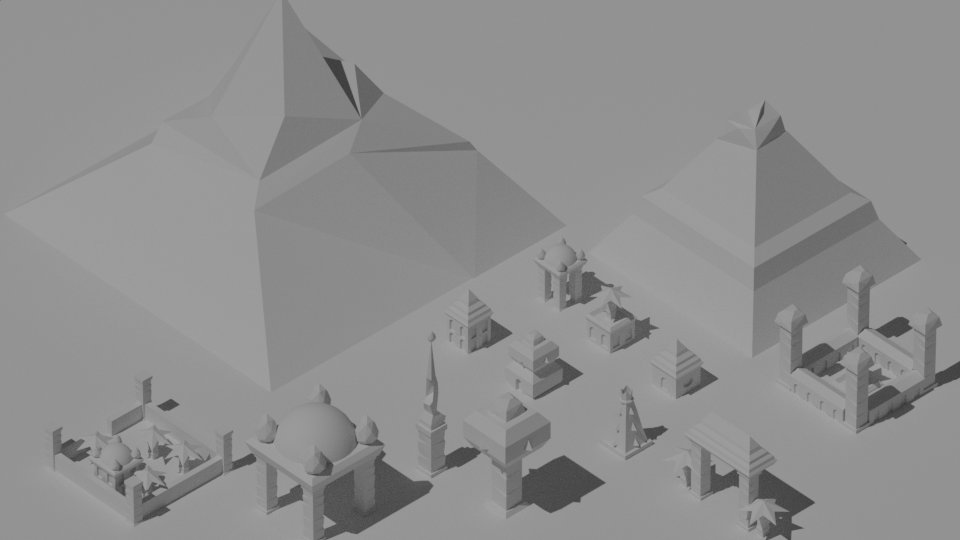
The world was modelled by cloning the tiles and mountains as a grid with a transparent overlay of a set of Westeros and Essos maps. Tiles were then selectively deleted to arrive at the shape of the map. The forests were done with a hair particle system, rather than the fixed distribution used in the game. The cities were assembled to more closely resemble their GoT counterparts, rather than the monolithic Jenga towers of the game. Slap on a few rotating gears here and there, and you’ve got your cities ready to slot onto the map.
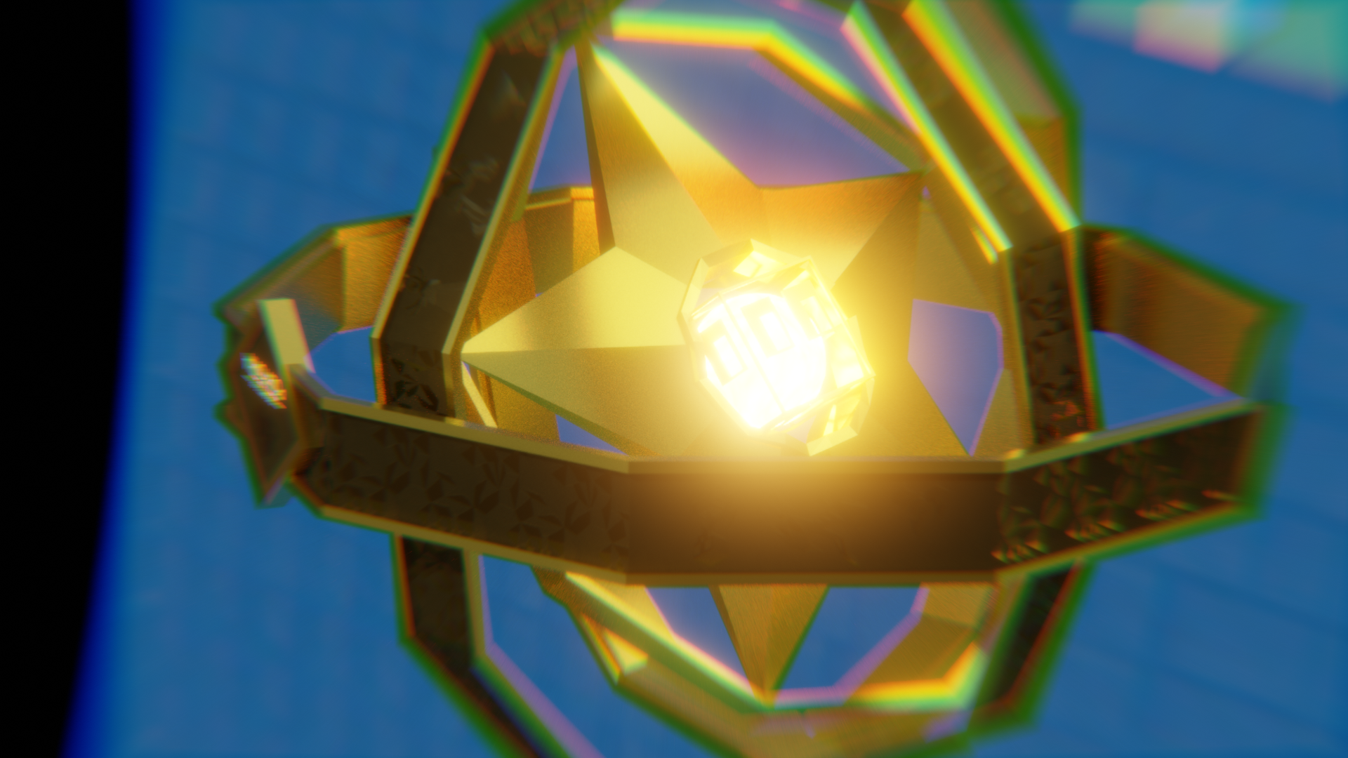
Finally, the astrolabe consisted of three spinning octagonal rings, a resource star (the in-game currency for anything and everything), with a Midjiwan head caging the Sun.
Materials and Textures
I opted for solid colours on nearly everything except the faces of the tribe characters on certain gears (like GoT does with their house sigils), and the astrolabe. I used simple normal and roughness maps to give these components an engraved look. In hindsight, I should have made the effect more pronounced for the character heads.
On the astrolabe in the original, the three close-up cuts show the conquest of Valyria, Robert’s rebellion, and the crowning of House Baratheon (all symbolically). For my video, I used symbols to show the three stages of the game. The early game village being conquered, and ruins. The mid game warfare with an Elyrion dragon, burning a forest and a building. The end game victory (by Polaris) showing their super unit, the Gaami, their Gate of Power, and a trophy. The remainder of the rings were textured with the game’s cloud sprite.
Animation
Animating this project was mostly straightforward, apart from camera movement. For some of the more complicated rigs (e.g. the astrolabe), I set some empty objects to be children of the target objects. I then used constraints (copy position and damped track) and animated their influence to get the desired camera movement.
Compositing and Rendering
Shallow camera depth of field, lens distortion/chromatic aberration, glare, and bloom were all added in Blender to give the renders the miniature look achieved in the source material. The render time for such a short animation was crazy, in excess of 220 hours for a HD1080 at 24fps all handled by my other computer which had a Nvidia Quadro K4200. Maybe time to build my own render farm?
Audio
I have never attempted music composition before, so composing the score for this video was equal parts humbling and frustrating. Polytopia’s soundtrack is minimal, percussive, and synthesiser-drenched. A Song of Ice and Fire is orchestral. The two are difficult to blend. I used jprtoledo’s string arrangement as a starting point.
I know I wanted the music to be video game-ish, so I originally used rudimentary synths and 8-bit samples to try and achieve a chip-tune like colour. However, this made my ears bleed, particularly at the higher frequencies. I also used samples from the game’s main soundtrack for all the main melodic lines, but this was too sparse and choppy.
Ultimately, I used a bunch of synths with a mixture of spacey and Caribbean sounds which sounded goofy and fun. The game’s main menu music sample was then used as a drum line which gives the track a pulse like the thumping drums of the original. Finally, I added the game’s “Conquest” sound as an orchestral hit at the start of the track, and right before the abrupt cut to black at the main title.
In post-production, I added a blip sample from the game where the magnifying glass is used to cut the transition sequences’ zooms.
Conclusion
This project was GIGANTIC for fan art, in excess of 240 hours working time, and an additional 220 for rendering. However, it is satisfying bringing it to a close, and to bring Midjiwan’s charming world into the 3rd dimension, with many lessons learned on the way to take forward onto next projects (for which the list keeps on growing).
Assets Video (20 October 2019 Update)
The models that were built as assets for the project obviously could not all make it into the final video as they would crowd the city layouts. However, they appeared so beautiful in the end, that it would be a shame not to render each one, so I decided to render a showcase video.
I quickly whipped up custom music for this video based on the main menu theme with short motifs for each of the tribes’ own soundtracks.
